Designing a new B2B SaaS tool
my role
I was responsible for the ux design of the platform. That included planning UX activities, research, running workshops, low and high fidelity design for desktop, mobile, industrial touch screens, paper (e.g. invoices), developing the branding, and communication with stakeholders & developers.
key learnings
It was the first time I had the opportunity to design a new product from scratch. If I had to start over again, I would make many things differently, showing me how much I’ve grown as a designer. I’ve built great relationships with the other teammates, making my work both user-friendly and easier for others to work with me. As a side benefit, I improved some processes at the company.
our process
We visited the customer, first understanding the high-level workflows and then diving into details while developing different features. I conducted multiple rounds of user interviews, contextual inquiries & testing prototypes and early-stage solutions. Mapping existing processes helped us identify pain points & inefficiencies of existing workflows.

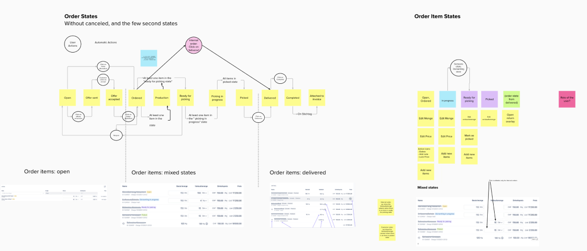
designing processes
Journey mapping is one of my favourite exercises, helping me understand how different elements come together into a large ecosystem. As some processes happened outside of the legacy software (excel & paper), we added improvements focusing on the end-to-end experience of each process.
One of the biggest challenges was to tackle underlying problems and not to provide solutions the user was asking for. This was particularly challenging, as our users were also our clients.
designing for the right device
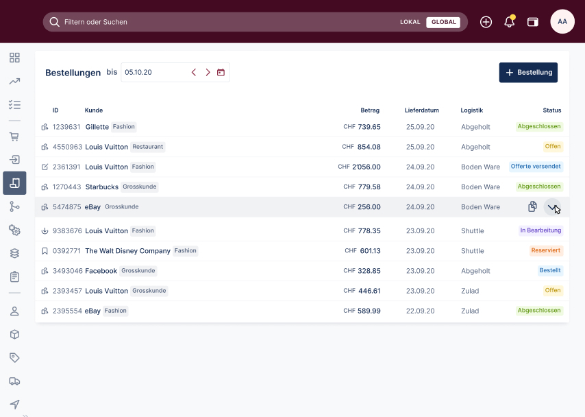
desktop first
Expert software is used on large screens. As all our office workers had larger screens, the challenge was to develop an interface that would be both legible on a 13-inch laptop and a 27-inch screen.
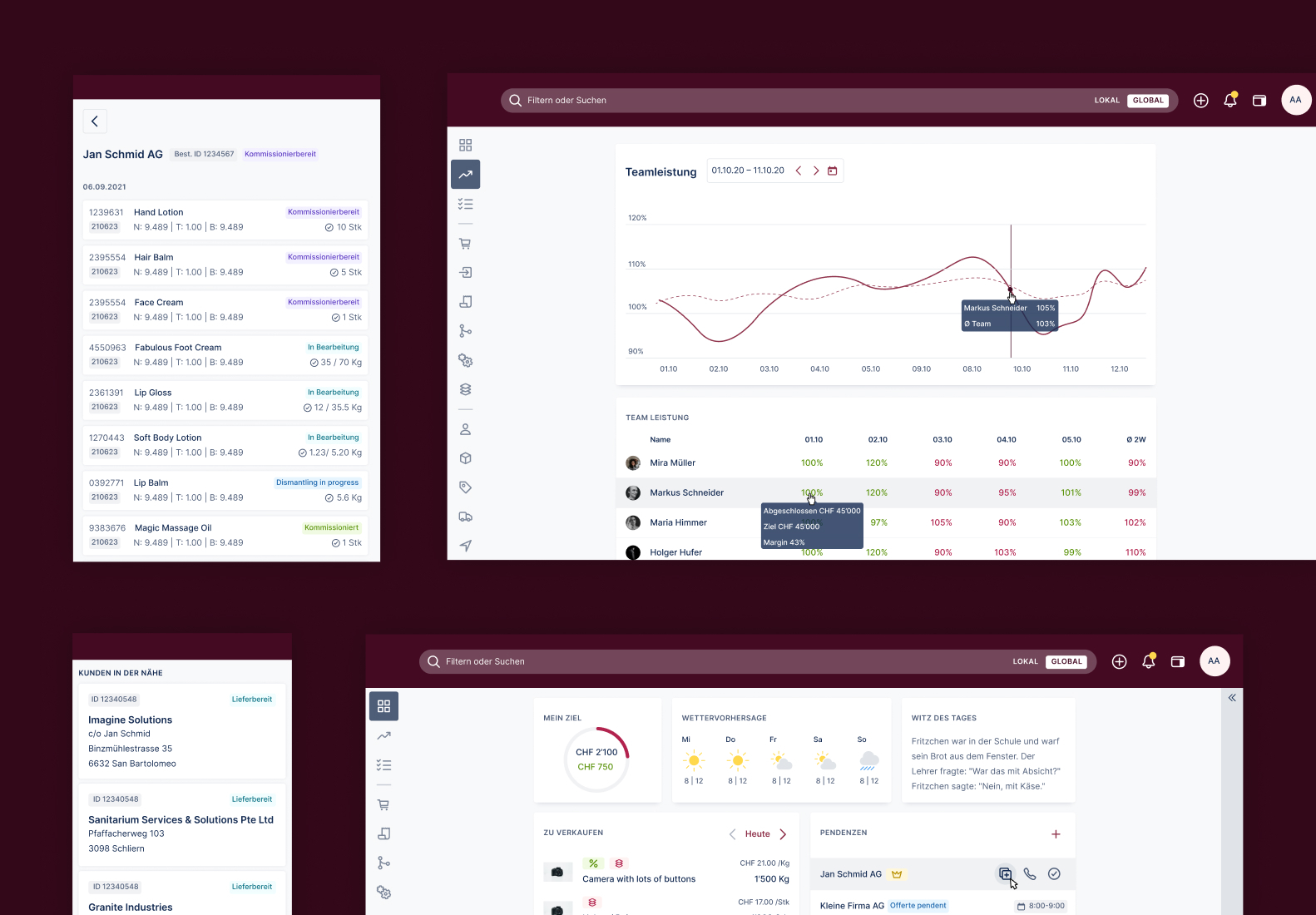
mobile & tablet
Understanding the processes was crucial to choosing the right device. While office workers work on large screens, a driver could use the tool on his phone while delivering goods.
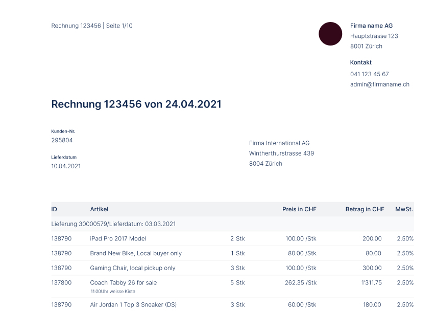
paper
In the time of technology, there was still a need for documents on paper (or PDFs). Among others, I analysed the Swiss envelope format, to ensure the address would fit within the address field.
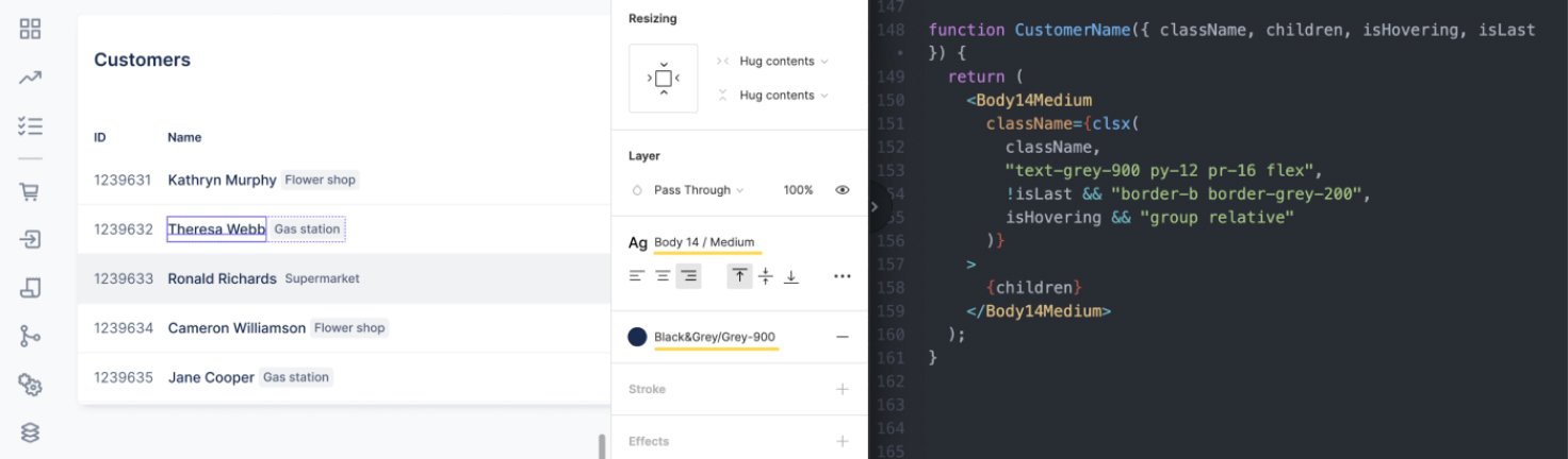
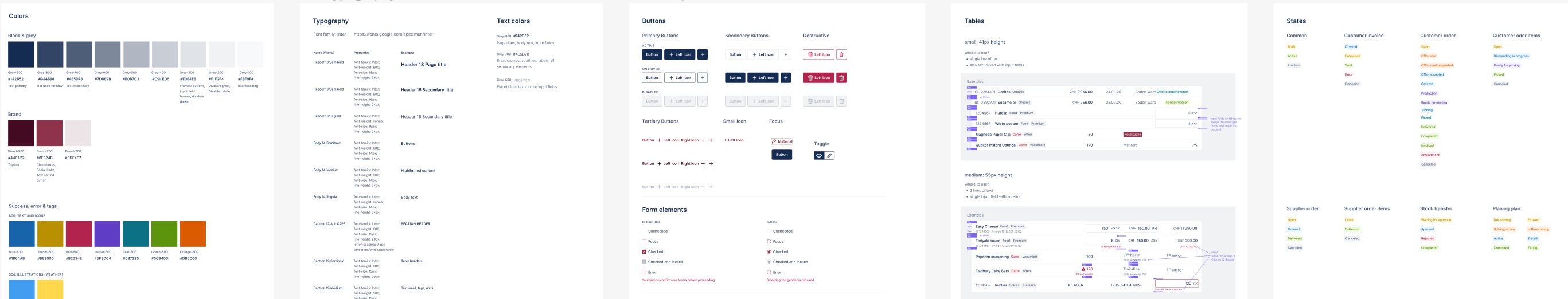
scalable design system
The interface of a complex tool is needed to be able to expand in the future. As a starting point, I analysed similar tools and developed a simple yet highly scalable interface. I collaborated with a front-end developer, and we aligned the naming of the elements in Figma and code. When a new developer joined the team, he was positively surprised by how easy it was to work with our designs.
learnings from developers
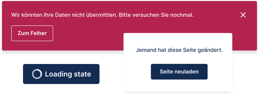
As this was a cloud-based solution, we were challenged by the latency of fetching information from the cloud. Because our users expected almost no latency, the developers suggested using an optimistic UI. That required additional design for edge cases, such as two users trying to edit the same information or any server errors. I designed additional UI elements making sure the user can easily recover from errors.