challenges
Designing for myself, without an "official deadline" made it much more challenging to keep a reasonable timeframe and narrow down the scope. Also, doing the coding myself was much more work than I originally anticipated.
solution
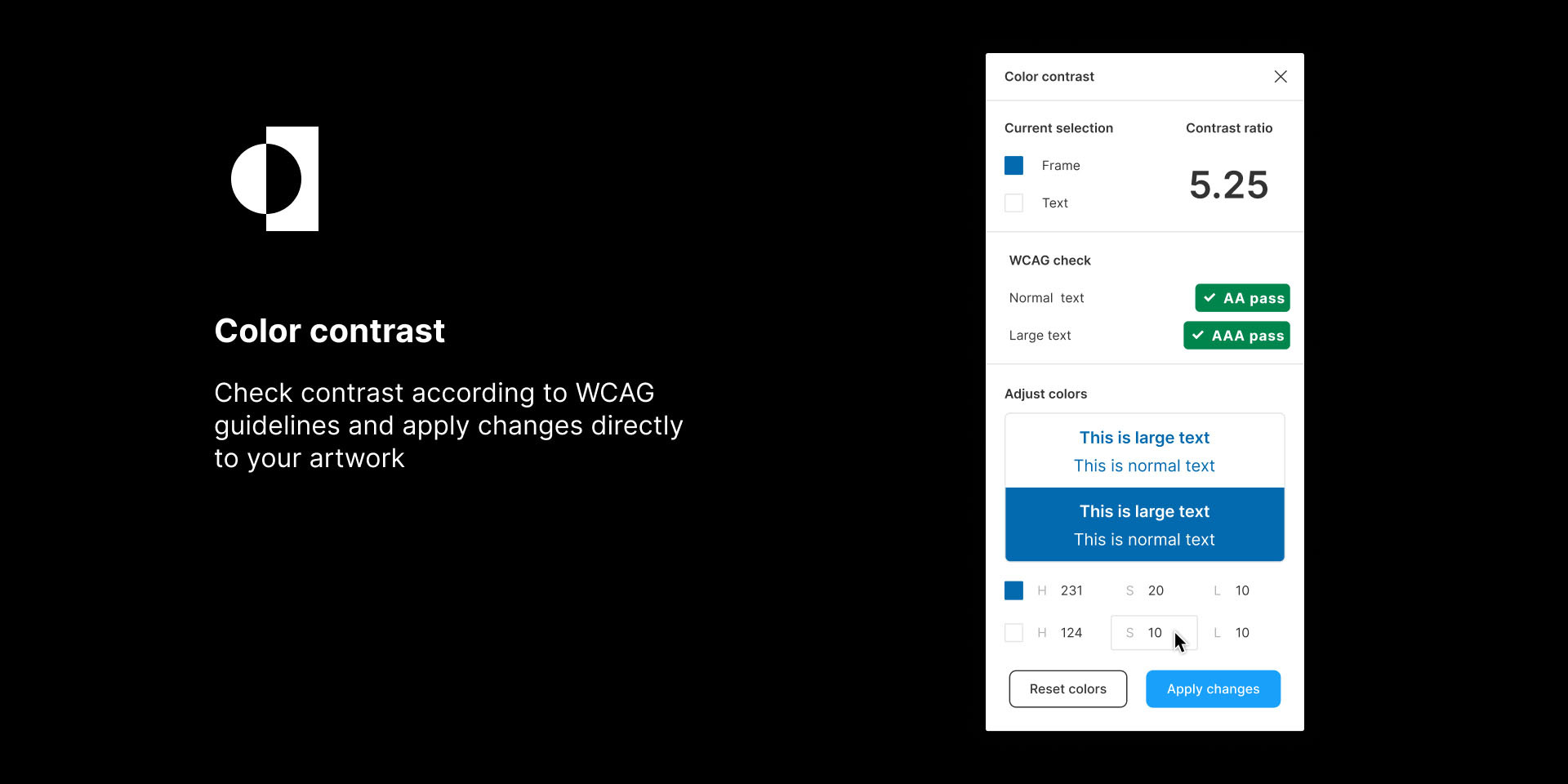
A fully functioning plugin for Figma that checks the color contrast based on a selection, and lets the user adjust the colors and apply the changes to the design.
key learnings
Since I was designing this feature for myself I took my existing flow as a starting point. Testing it with users made me realize that there was a lot of room for improvement in the existing flow. I remembered that I also struggled at the beginning when using the existing tool. So the learning would be: always question if existing products do the right thing.
my contribution
tools & languages
timeline
what is the problem?
While working on new products I check if the color contrast is compliant with WCAG guidelines. When selected elements do not meet the standards, I have to close the plugin, adjust the colors in figma, open the plugin again and repeat this process. Sometimes I have to make a few rounds of adjustments, which makes this workflow inefficient.

can I make it? – proof of concept
Since this was my first experience with both developing for Figma and JavaScript, I started with a simple proof of concept. I created a very basic interface to check if the functionality of getting colors from selected rectangles would work.
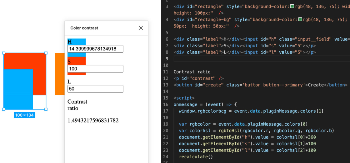
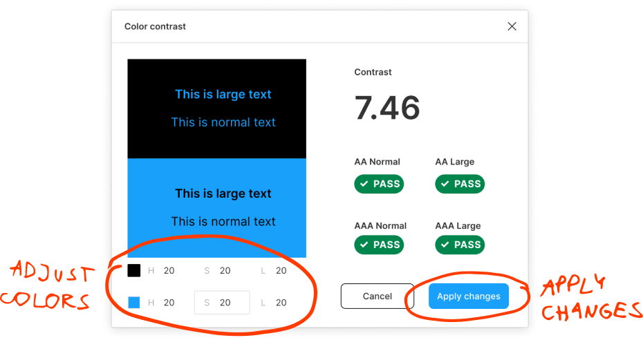
take what you have and make it better
As a starting point I looked at the tools I was using and added the feature I needed. I improved my existing user journey to change the colors directly in the tool, which would give me an instant feedback and then I could apply the adjusted colors to the selection.

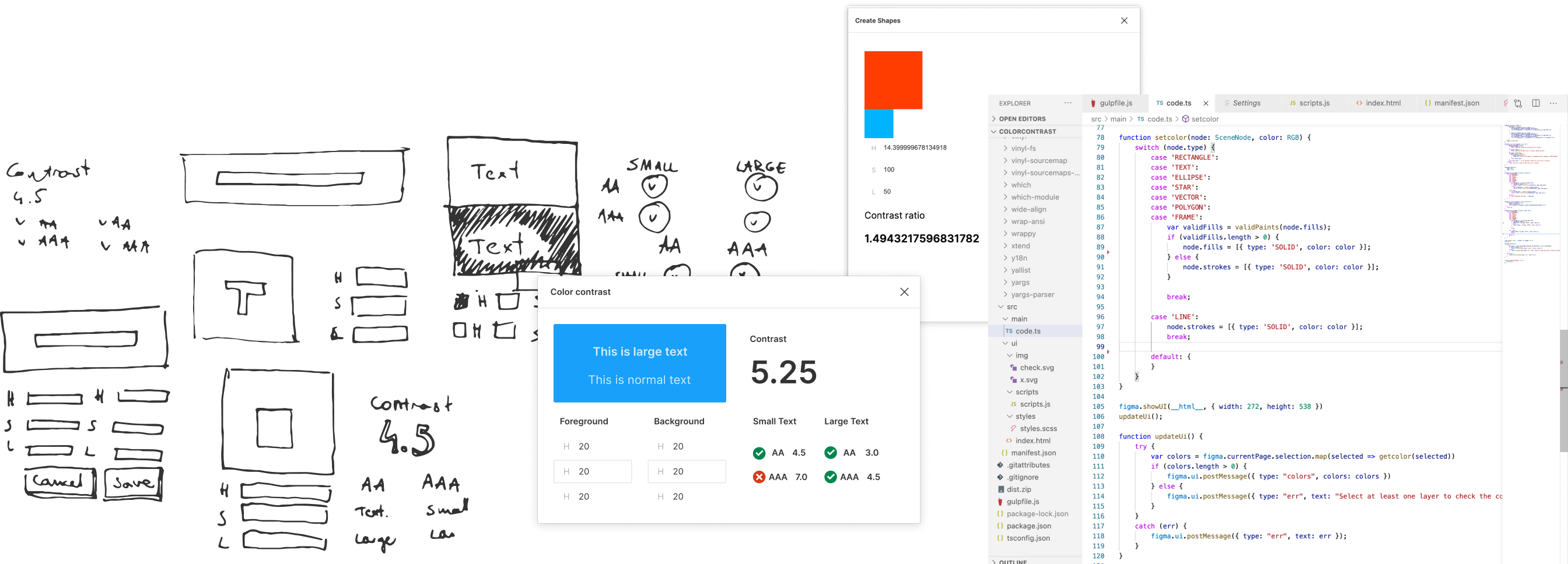
from sketch to code
user testing had a huge impact
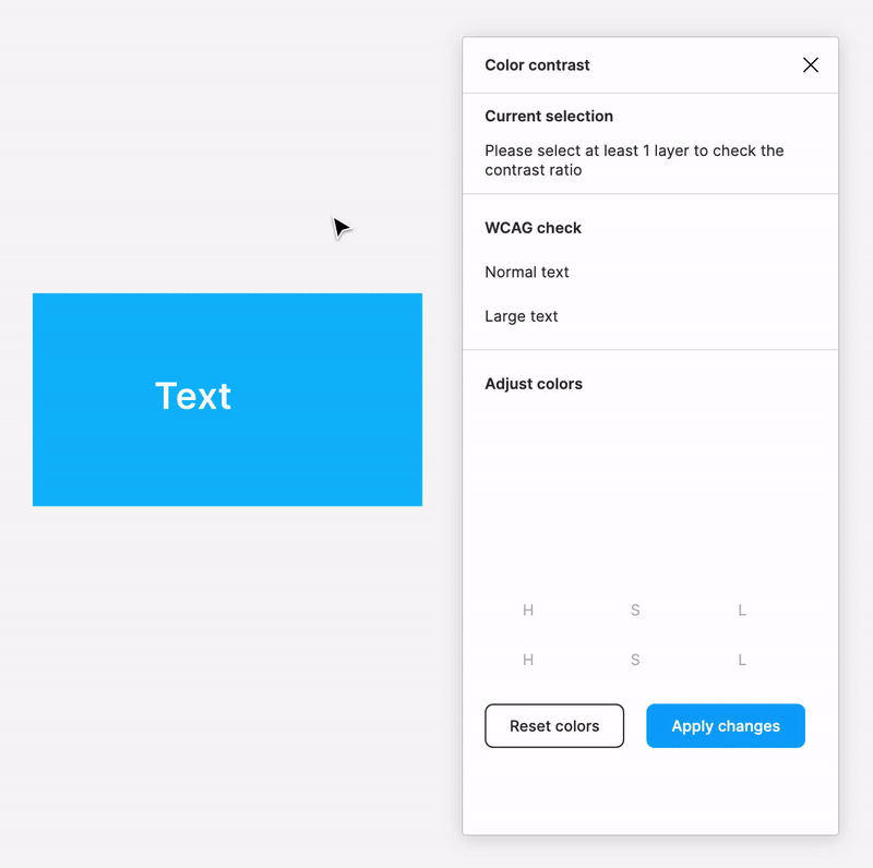
I tested the working plugin with 5 people. 80% of them said they would use it in their work, but I also uncovered 2 large usability issues:
#1 – users were lost when opening the plugin with nothing selected
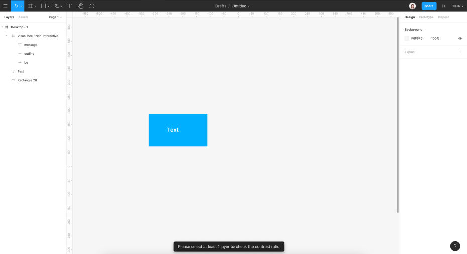
What happened?
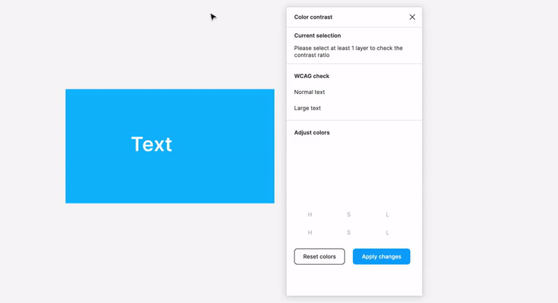
Solution
#2 – functionality of adjusting colors wasn't clear enough
What happened?

Solution
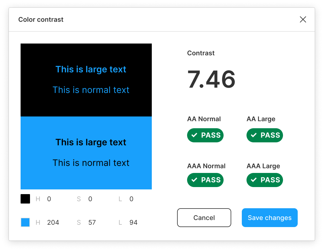
pivot: getting things right
Fixing the two major issues meant that I would have to change the layout completely. At this point, I realized that it would be worth the additional design & front-end effort so I decided to do so.
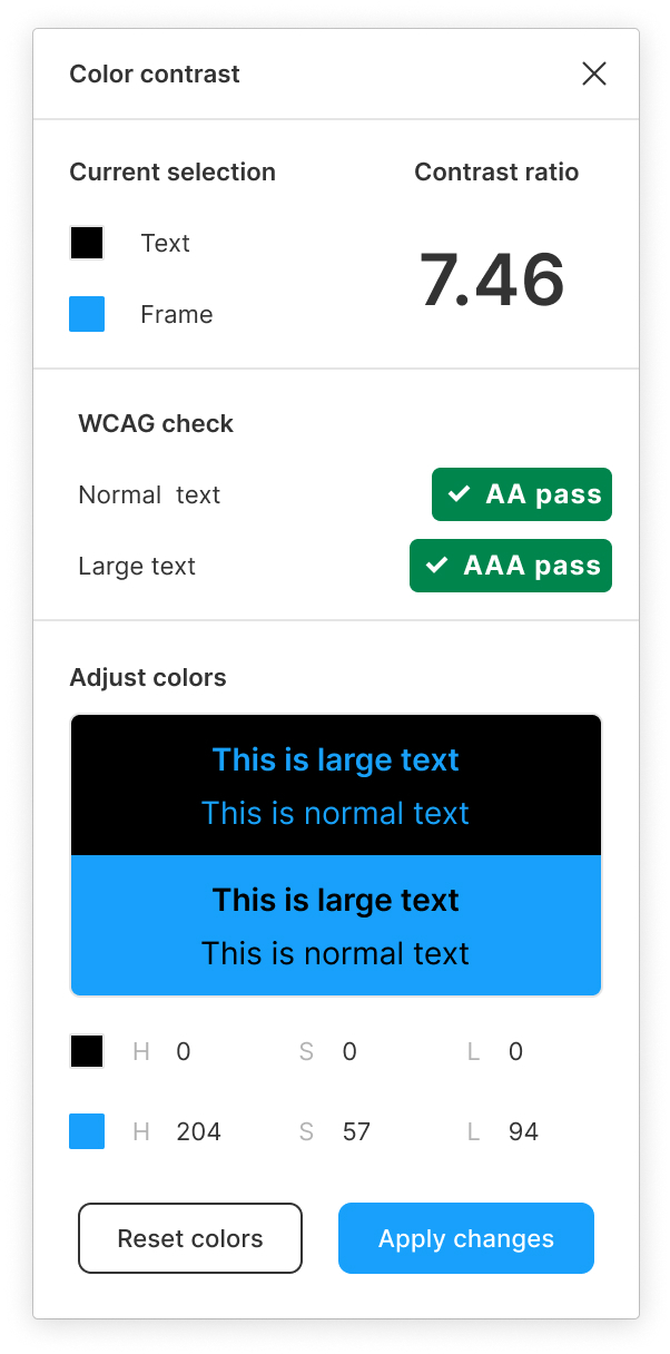
results
I published the plugin to Figma Community. You can download it here